Unity in design, simplicity in techniques, and precision in detail: this is our holy trinity. Since its creation in 1982, our company has never deviated from this path. And thus, kreon has grown into an international point of reference in lighting fixtures. We are known by architects, interior designers, and engineers around the world. We believe that beauty is not created by adding one more detail, it is conceived by removing the last.
The design of our collections is founded on this belief. Every lighting solution is reduced to the essential components.
We are constantly focused on product and process innovation
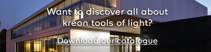
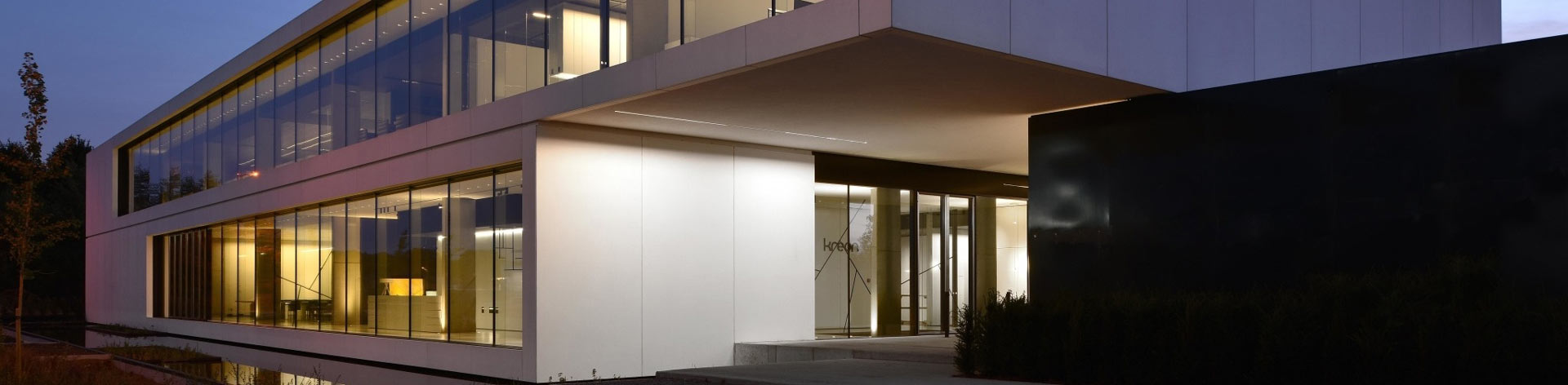
Our new headquarters in Opglabbeek, which were designed in absolute accordance with our aim for purity, is the perfect example of this. It is both our creative laboratory and our service centre, with offices, studios, big showrooms, and commercial meeting rooms. Our new headquarters also seamlessly ties into our production unit.
We became the owner of belux in 2016
This well-known Swiss designer and manufacturer of advanced lighting solutions is a part of the famous Vitra Group. This takeover ties in with kreon's current expansion strategy. The kreon and belux brands are complementary and together offer a wide range of lighting solutions. belux focuses on design that catches the eye by world-famous designers, like Frank Gehry. kreon creates lighting solutions that blend in with the architecture.
"These two major investments required a corporate restyling, one that graphically and conceptually represents this important evolution."
The new corporate identity was developed by Catapult and has been thoroughly prepared after much consultation and research. Together with Catapult's graphic designers, we analysed our identity, including surveying our employees and customers, both nationally and internationally.

Visual communication plays an important role in strengthening the identity of our kreon and belux brands. We want to exude minimalism and modernity. The new corporate identity has had a positive effect on our brand awareness, but it is never obtrusive.
"The corporate identity is a cohesive, well-thought-out system. It provides us with a framework and a tool, within which we have room to be flexible. And that's why it works. The more we use the corporate style, the more we love it."
An evolutionary approach to the design of the new logo was needed due to kreon's quality label. The kreon logo was restyled with a strong focus on balance and minimalism. Every unnecessary detail was removed from the design, giving them a modern appearance.

The corporate style font, 'kreon', designed by font designer Fred Smeijers, was developed in the same way, thus tying into this as well. The corporate style font has been optimised for use in digital contexts, which is an increasingly more important component in kreon's communications.
The cohesion between kreon and belux appears in the use of the typography in the communications. You can see it in the joint layouts of the two new catalogues.
a new logo

The kreon logo was restyled with a strong focus on balance and minimalism. Finding the right balance between the letters in the logo was the basis of the design. The logo could not look nostalgic or retro. The letters ‘r’ and ‘n’ in kreon formally refer to the old typography.
"The design of our logs and typography reflected our manner of thinking, where
each creation or solution is reduced to the essential components."
a new corporate identity
To give the corporate identity power, we decided to develop a font that followed on from these two logos. 'kreon' is a geometric sanserif
font with modern proportions that replaces the old 'Neuzeit-Grotesk' corporate style font. The font has an even stroke both horizontally
and vertically, which creates peace, balance, and a contemporary look.
The corners of the letters are slightly rounded, evoking diffused light that gives a soft touch to the contours of the letters. The use of lower-case letters in the logos ties in with our minimalistic, modern approach and is consistently carried through in the product names, which is always preceded by the brand name.